
Sweegen
Well. Into the future
The Ingredient and Flavors Industry has long been dominated by 10 highly corporate, highly-competitive players. Enter Sweegen. A David among the Goliaths. Launched as a spin-off of its parent company, Blue California, Sweegen was created as a next generation Stevia producer on a mission to reduce the sugar and artificial sweeteners in our global diet to promote wellness.
-
Things looked pretty sweet for Sweegen. But the brand had a bigger appetite than that. In 2021, they set out to expand their portfolio. To go from being a single ingredient supplier to becoming a full-service, product developer pioneering innovating a smorgasbord of new ingredient technologies and taste and flavor solutions designed make a positive impact on health, wellness and sustainability.
Forward-looking, Dynamic. Agile, Entrepreneurial. Cutting-edge. A pioneer in biotechnology. With a So-Cal cool, health and wellness mindset, Sweegen needed a new identity. Sweegen chose Insurgents for their brand refresh.
-
We reimagined every aspect of the Sweegen brand to be heroic, modern, clean, graphic and distinctive with tremendous taste appeal.
We redesigned the logo – eliminating the signature stevia leaf and overly green appearance – instead opting for a letterforms that are bold, clean, geometric and dynamic. We added a dynamic mark that alludes to molecules in motion. And we animated the brand symbol to reflect the brand’s forward momentum.
We brightened the brand palette, refreshed the typography and energized the photography – giving the brand a crisp, clean stylized look and feel.
-
Brand Story & Messaging
Brand Strategy
Brand Visual Identity
Brand Logo
Brand Voice
Web Design
New Products
We redesigned the Sweegen logo with letterforms that are bold, clean and geometric. And we animated the brand symbol to reflect the brand’s forward momentum.
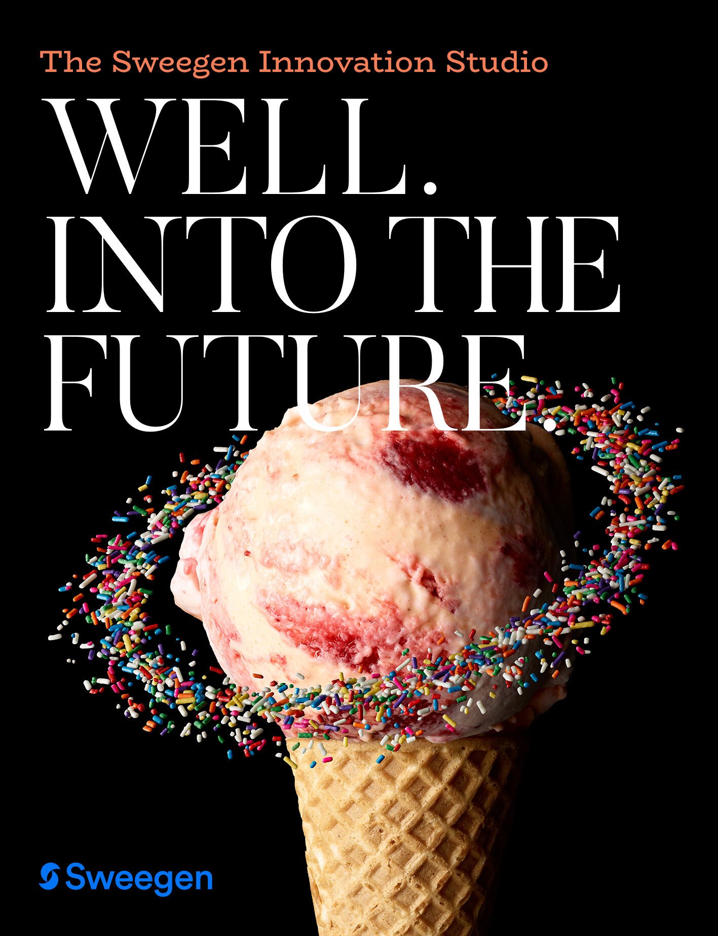
Well. Into the future
Our new tagline positions Sweegen as a Tasteblazer who is continually forging the future of wellness in food and drink.

At Sweegen, thanks to our proprietary bioconversion process, our Signature Stevia delivers the satisfying sweetness of sugar minus the calories.

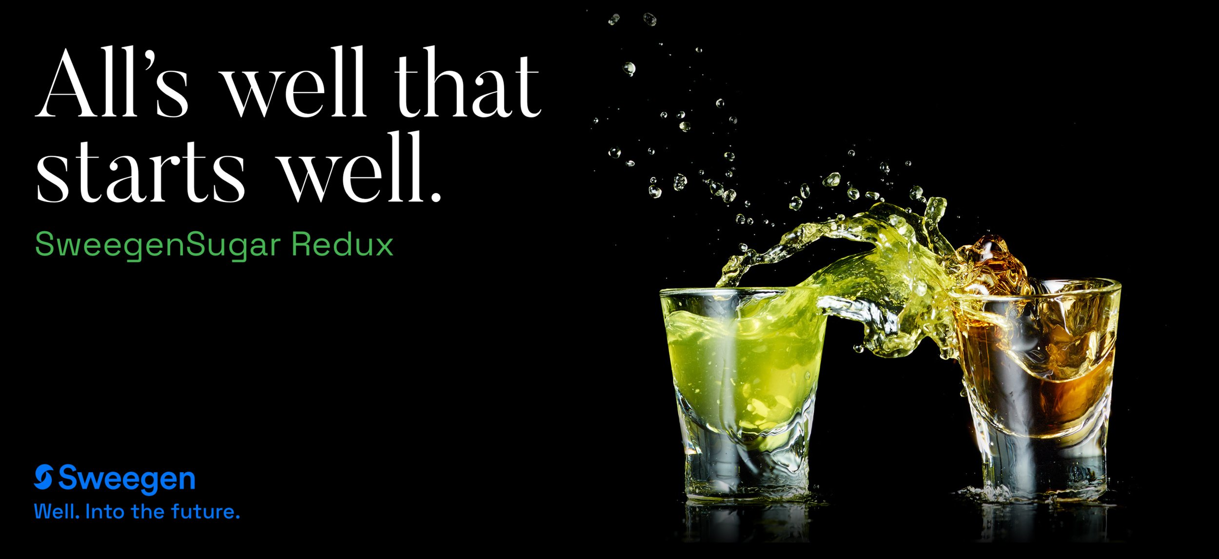
Two glasses, one with green liquid and the other with brown liquid, splash as they collide, against a black background. Text on the left reads, 'All's well that starts well. SweegenSugar Redux,' with the Sweegen logo and tagline, 'Well. Into the future.'
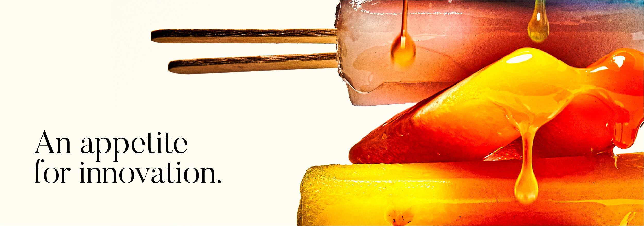
A close-up of dripping honeycomb and honey with text that says 'An appetite for innovation.'
We established The Sweegen Innovation Studio as warm and welcoming place to cook up new ideas - far cry from the cold, over-industrialized labs you may have experienced in the past.

Splash of dark soda with the text 'Be better in beverage' on a beige background.

Close-up of a stack of glazed strawberry candies with a pink background and black text that reads 'Deliver delicious sweetness minus the sugar.'
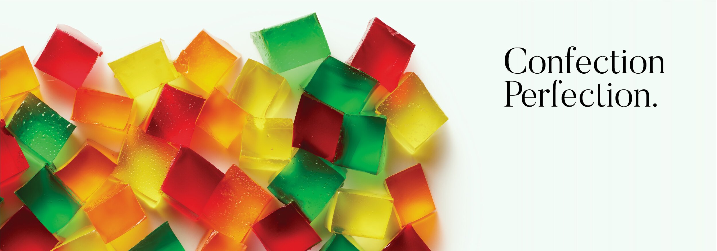
Colorful assorted confections on the left and the phrase 'Confection Perfection.' on the right.
Icons and text highlighting product features: Non-GMO, Nature Based, Easy to use, Cost effective, Label Friendly.

Background image of creamy vanilla ice cream with a quote about teamwork and marketing by Sally Aaron in black and red text.
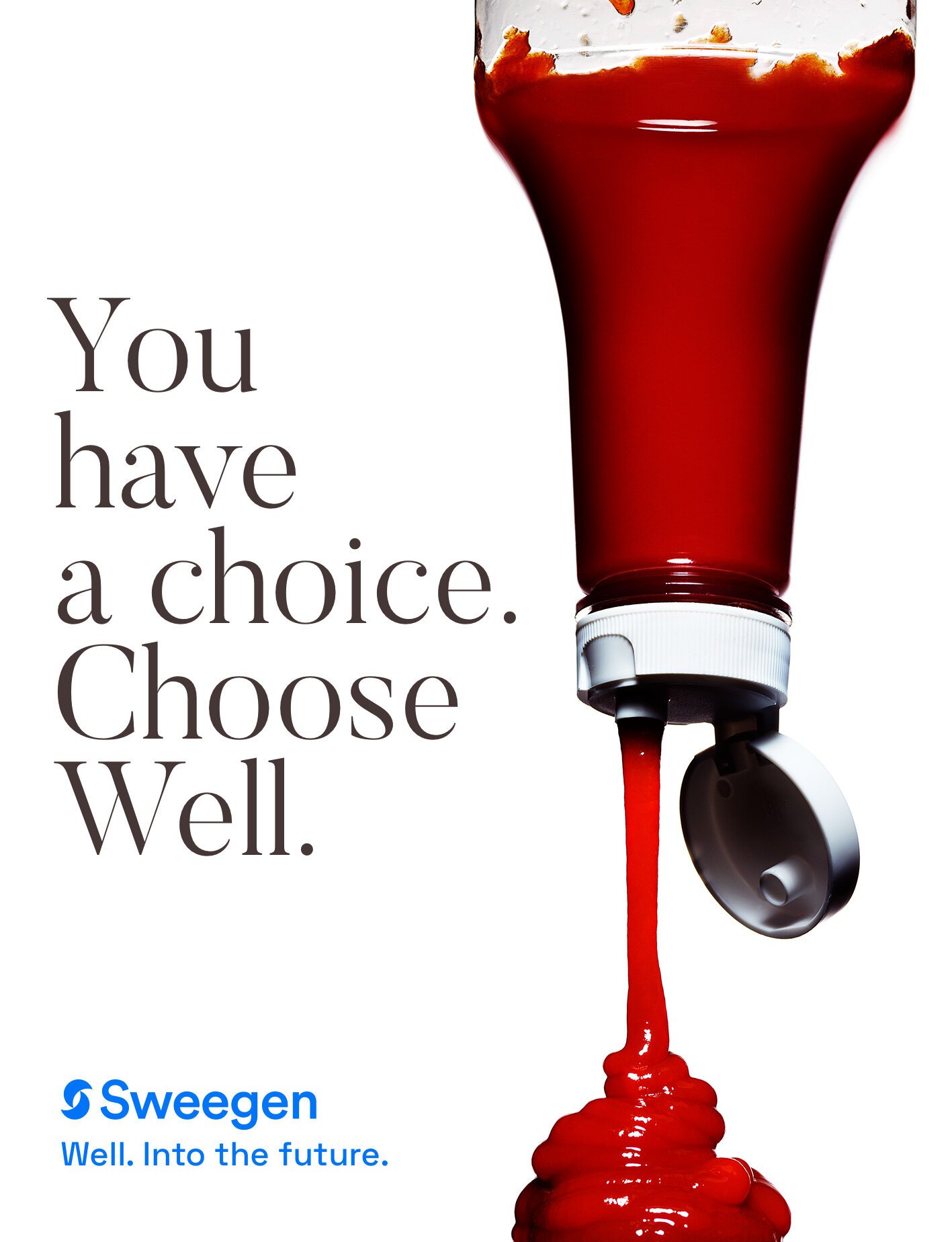
You have a choice. Choose well.
